
Homeowners Insurance
Urban Migration Patterns Show a Majority Leaving Biggest Metros for More Affordable Markets

America's largest metropolitan areas have seen hundreds of thousands of residents leave for less dense, more affordable locations.
However, US Census data showed that almost everyone who had moved out of a major US metro area ended up settling in other moderately large cities. So, while millions of city-dwelling Americans have moved to less densely populated areas for more affordable housing, most appear reluctant to abandon the urban setting altogether.
Key findings of the census data:
- The biggest cities saw the largest outflows: Leading metros such as New York City, Los Angeles and Chicago posted the biggest net losses in city-to-city migration. The biggest net gains went to somewhat smaller cities, such as Phoenix, Austin and Riverside, California.
- The largest migrations are mostly local: Eight of the 10 most popular city-to-city moves were less than 100 miles. The two exceptions were New Yorkers who moved to Miami (1,092 miles) and Angelenos who moved upstate to San Francisco (338 miles).
- Most of those who moved sought smaller cities with affordable housing: Out of 3.7 million city dwellers who moved to a different major metropolitan statistical area (MSA) in 2017, 55% chose one with more affordable housing: an average 34% cheaper median value for a local home.
- City dwellers flock together: On average, about 86% of people who moved to one of the 100 largest metro areas came from another top 100 MSA. More than 55% of newcomers to every MSA came from other big cities.
- Smaller cities experienced higher turnover: At the same time, smaller metros experienced a higher proportion of people coming and going. For instance, Colorado Springs, Colorado, saw a turnover of 9.6%, relative to its total population. The average among the top 100 MSAs was only 4.5%.
Major metros had the greatest net losses in migration
The most obvious feature in the metro-to-metro migration data was the net negative flow of people from the nation's largest cities. In other words, there were more locals departing major cities like New York and Los Angeles than newcomers arriving from other cities.
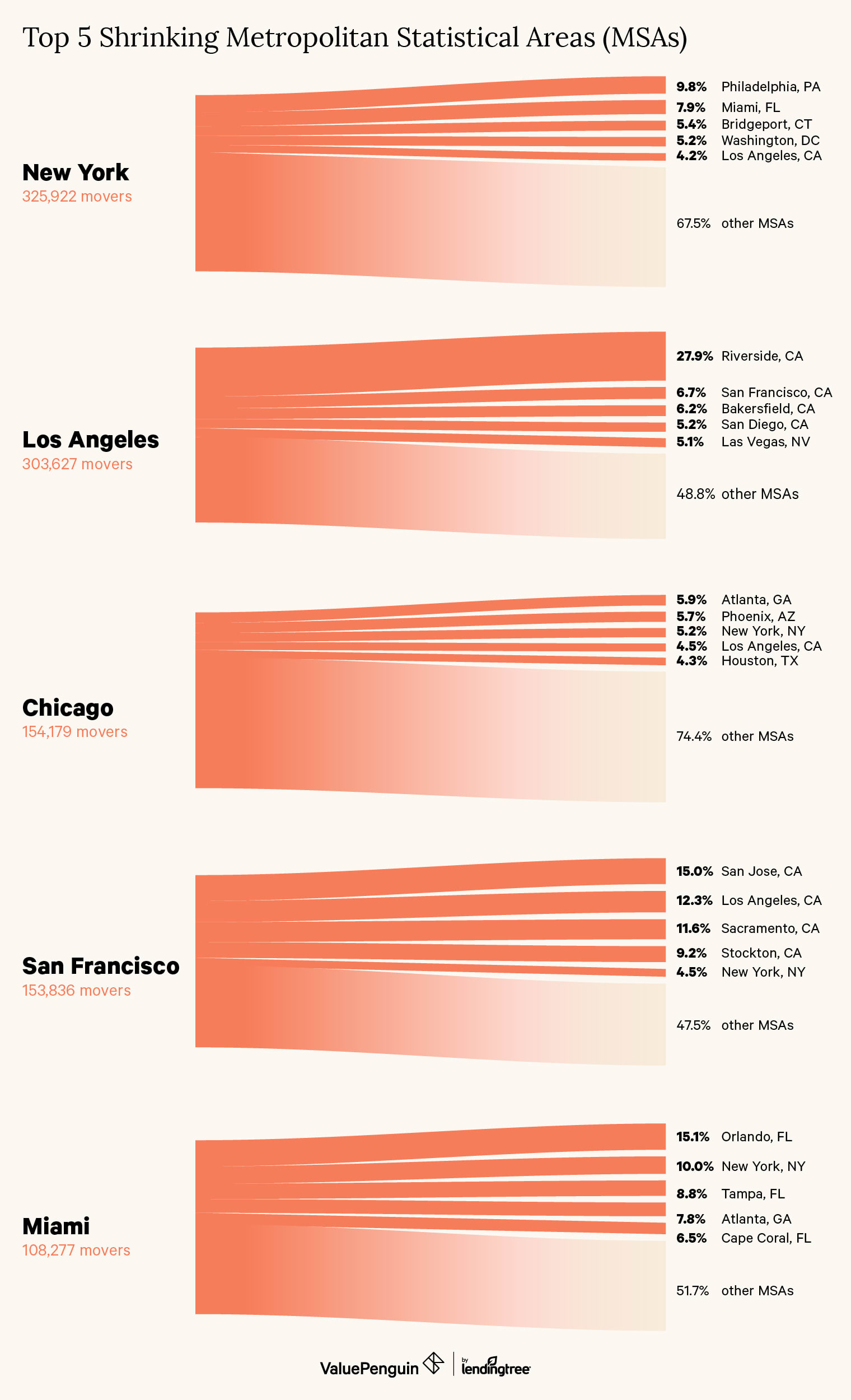
Metro areas with the largest net outflows
MSA | Net migration | Top destinations (% of total) | ||
|---|---|---|---|---|
| New York | -196,400 | Philadelphia (8.6%) | Miami (6.9%) | Bridgeport, CT (4.8%) |
| Los Angeles | -119,138 | Riverside, CA (26.7%) | San Francisco (6.4%) | Bakersfield, CA (5.9%) |
| Chicago | -70,273 | Atlanta (5.5%) | Phoenix (5.3%) | New York (4.8%) |
| San Francisco | -42,826 | San Jose, CA (14.1%) | Los Angeles (11.6%) | Sacramento, CA (10.9%) |
| Miami | -26,651 | Orlando, FL (13.3%) | New York (8.8%) | Tampa, FL (7.8%) |
| Baltimore | -21,345 | Washington, D.C. (32.8%) | Philadelphia (5.9%) | New York (5.4%) |
| Kansas City, MO | -12,783 | St. Louis (8.6%) | Dallas (8.1%) | Wichita, KS (5.2%) |
| Washington, D.C. | -12,675 | Baltimore (13.9%) | New York (6.7%) | Virginia Beach, VA (5.8%) |
| Cleveland | -12,388 | Akron, OH (19.6%) | Columbus, OH (14.0%) | Cincinnati (9.2%) |
| Greensboro, NC | -12,341 | Washington, D.C. (7.3%) | Las Vegas (6.7%) | New York (6.3%) |
A significant number of people who left one major city ended up moving to another. For instance, nearly a third of people who moved out of Baltimore settled in nearby Washington, D.C. Meanwhile, the nation's capital saw only roughly 14% of its residents leave for Baltimore. The discrepancy illustrates a common theme in the data: People who moved away from big cities tended to favor destinations both nearby and slightly less urbanized.
While the biggest cities posted the biggest declines from metro-to-metro migration, midrange cities like Phoenix and Austin were among the most popular destinations.
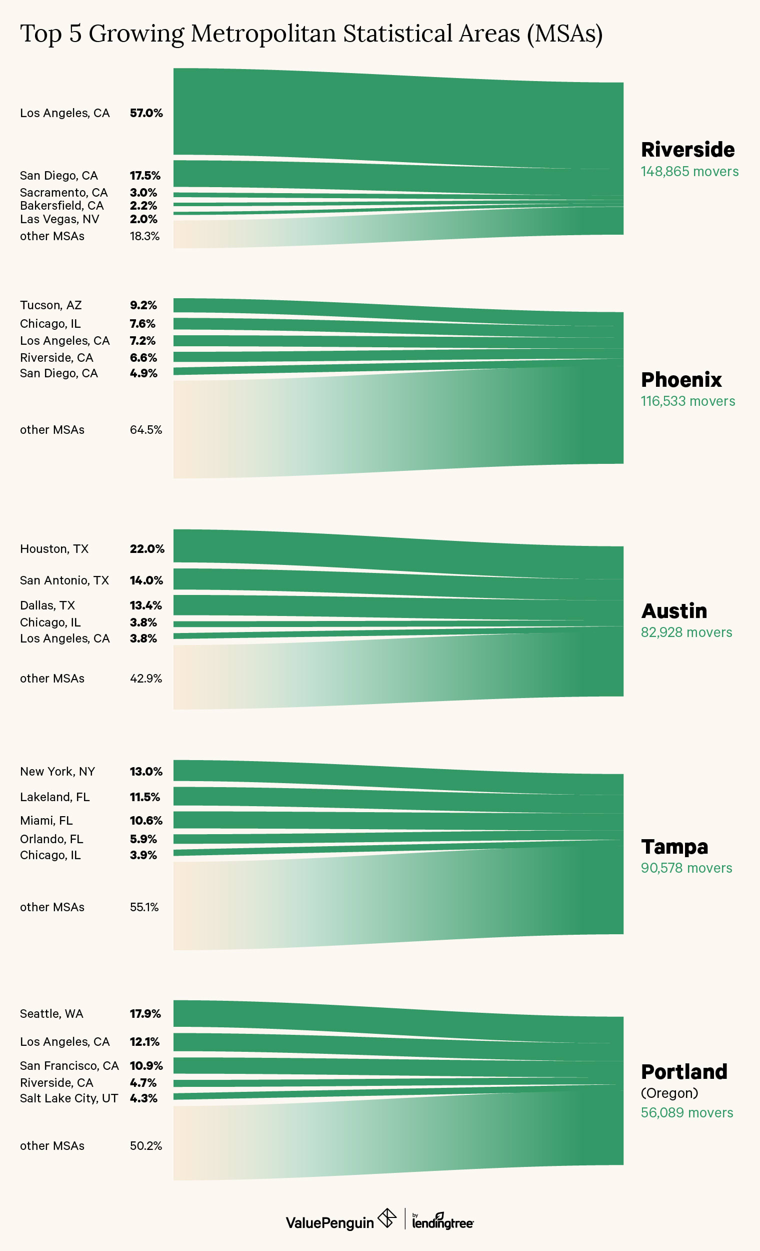
Metro areas with the highest net migration
MSA | Net migration | Top origins (% of total) | ||
|---|---|---|---|---|
| Riverside, CA | 48,003 | Los Angeles (56.1%) | San Diego (17.2%) | Sacramento, CA (2.9%) |
| Phoenix | 43,815 | Tucson, AZ (8.8%) | Chicago (7.2%) | Los Angeles (6.8%) |
| Austin, TX | 25,862 | Houston (21.1%) | San Antonio (13.5%) | Dallas (12.9%) |
| Tampa, FL | 22,943 | New York (12.6%) | Lakeland, FL (11.1%) | Miami (10.2%) |
| Portland, OR | 19,981 | Seattle (16.8%) | Los Angeles (11.4%) | San Francisco (10.2%) |
| Deltona, FL | 17,873 | Orlando, FL (32.6%) | Miami (13.3%) | New York (9.8%) |
| Sacramento, CA | 15,497 | San Francisco (28.2%) | Los Angeles (16.9%) | Stockton, CA (6.6%) |
| Dallas | 15,278 | Houston (11.2%) | Los Angeles (8.9%) | San Antonio (5.8%) |
| Las Vegas | 14,005 | Los Angeles (23.8%) | Riverside, CA (8.1%) | San Diego (5.1%) |
| Boise City, ID | 13,440 | San Diego (14.6%) | Sacramento, CA (12.4%) | Salt Lake City (12.3%) |
For many of these fastest-growing cities, the bulk of their incoming population was from nearby or in-state metros. In the most pronounced example, half of the people who migrated to Riverside, California, came from Los Angeles. In Texas, nearly 48% of Austin's newcomers were from Houston, San Antonio or Dallas.
A majority of new arrivals were typically from out of state in MSAs that are the only major city in their state. For example, in Portland, Oregon, most of the new arrivals came from Seattle, Los Angeles and San Francisco. The situation was similar in Las Vegas, with several Southern California metros delivering 37% of Las Vegas's total incoming population in 2017.
The most popular migrations were under 100 miles
The Census data also enabled an analysis of specific metro pairings to identify which MSAs exchanged the greatest number of residents. Most of the largest migrations involved cities within 100 miles of each other, with just a few notable exceptions.
Origin | Destination | Movers (% of total leaving) | Distance |
|---|---|---|---|
| Los Angeles | Riverside, CA | 84,838 (26.7%) | 55 mi |
| Riverside, CA | Los Angeles | 37,181 (36.0%) | 55 mi |
| New York | Philadelphia | 31,862 (8.6%) | 95 mi |
| San Jose, CA | San Francisco | 27,728 (35.5%) | 48 mi |
| San Diego | Riverside, CA | 26,007 (22.7%) | 99 mi |
| New York | Miami | 25,670 (6.9%) | 1,092 mi |
| Baltimore | Washington, D.C. | 24,065 (32.8%) | 38 mi |
| San Francisco | San Jose, CA | 23,030 (14.1%) | 48 mi |
| Washington, D.C. | Baltimore | 22,748 (13.9%) | 38 mi |
| Los Angeles | San Francisco | 20,480 (6.4%) | 338 mi |
By far the longest mass movement of urban dwellers was from New York City: 8.6% who left New York found their way to Miami, nearly 1,100 miles to the south. The only other migration of more than 100 miles was from Los Angeles to San Francisco, an in-state move that nevertheless spans 338 miles.
In terms of volume, the flow of people within California dominated the list of major population shifts. The single largest movement was over a quarter of all departing Angelenos choosing the nearby metro of Riverside–San Bernardino. Interestingly, the reverse route, from Riverside to Los Angeles, was the second-largest migration. Yet Riverside remained a hub of movement, with 22% of people from San Diego choosing that city as well.
California had one other two-way pairing on the list of major migrations: between San Francisco and nearby San Jose. Over 35% of those leaving San Jose moved to San Francisco, while just over 14% did the opposite.
A majority of movers chose cities with lower housing costs
When comparing the destinations based on the median value of owner-occupied homes in each metro area, around 55% of city-to-city movers chose a new locale that had a lower median home value. For these cost cutters, the price of a home dropped an average of 34% from their original city to their new destination.
The table below lists the 10 metro areas whose residents stood to gain the greatest potential savings on buying a home if they moved. Living in a metro with a lower median home value not only lowers the barrier to owning a home but also reduces ongoing costs based on the home's value, such as property tax rates and homeowners insurance premiums.
How much did home prices change for people who moved to a new city?
Origin | Median home value (origin) | Average change in median value (after moving) | Total leaving |
|---|---|---|---|
| San Francisco | $723,096 | -44% | 163,748 |
| Los Angeles | $571,319 | -43% | 318,278 |
| San Jose, CA | $828,806 | -42% | 78,007 |
| New York | $430,254 | -36% | 372,362 |
| San Diego | $515,605 | -32% | 114,481 |
| Washington, D.C. | $418,469 | -30% | 164,185 |
| Bridgeport, CT | $431,893 | -29% | 42,017 |
| Seattle | $373,130 | -20% | 95,496 |
| Oxnard, CA | $546,035 | -16% | 21,137 |
| Austin, Texas | $246,900 | -3% | 60,627 |
Many of these top areas are known for their expensive real estate markets, which largely explains the significant discounts on housing once leaving these areas. Regardless of their city of origin, overall, the majority of movers nationwide picked less expensive places, suggesting that the cost of owning a home plays a significant role in steering migration between cities.
Methodology
This analysis of migration patterns among major US metropolitan areas is based on data made available by the 2017 US Census. The data accounted for the annual movement of the population in and out of each metropolitan statistical area, grouped by origin and destination MSA.
All of the "routes" between two MSAs for which migrations were recorded in 2017 were grouped and ranked to determine where the greatest number of people moved to and from MSAs. Net flows of population for each MSA were calculated by finding the difference between incoming and outgoing residents.
he average of median owner-occupied home values at all of the corresponding destinations, weighted by the number of people headed to each destination, was calculated to obtain the change in housing costs for every population leaving a given MSA
Excluded MSAs
This study focused on the data available for the top 100 MSAs by population in 2017. Among these, migration statistics were not available for MSAs around the following cities:
- Boston
- Denver
- Charlotte, NC
- Providence, RI
- Worcester, MA
- Syracuse, NY
- Winston-Salem, NC
- Modesto, CA